Birrukis
Brand Identity & Art Direction

A video to capture the viewer’s attention and introduce the new characters. Created using Adobe After Effects.
Concept
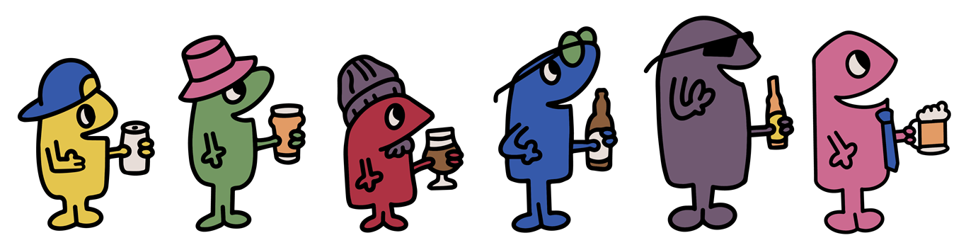
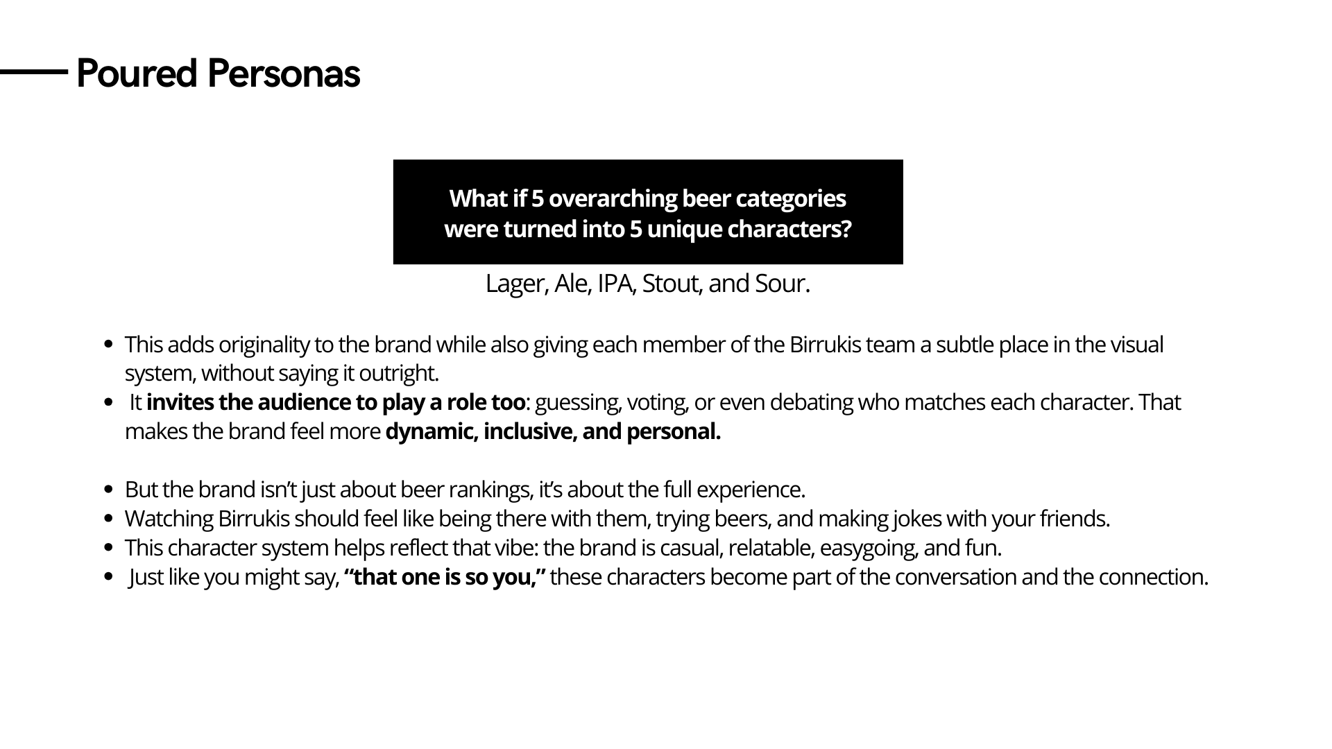
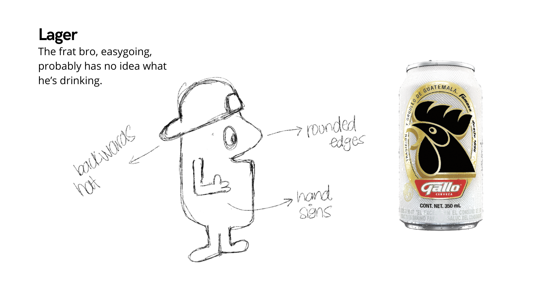
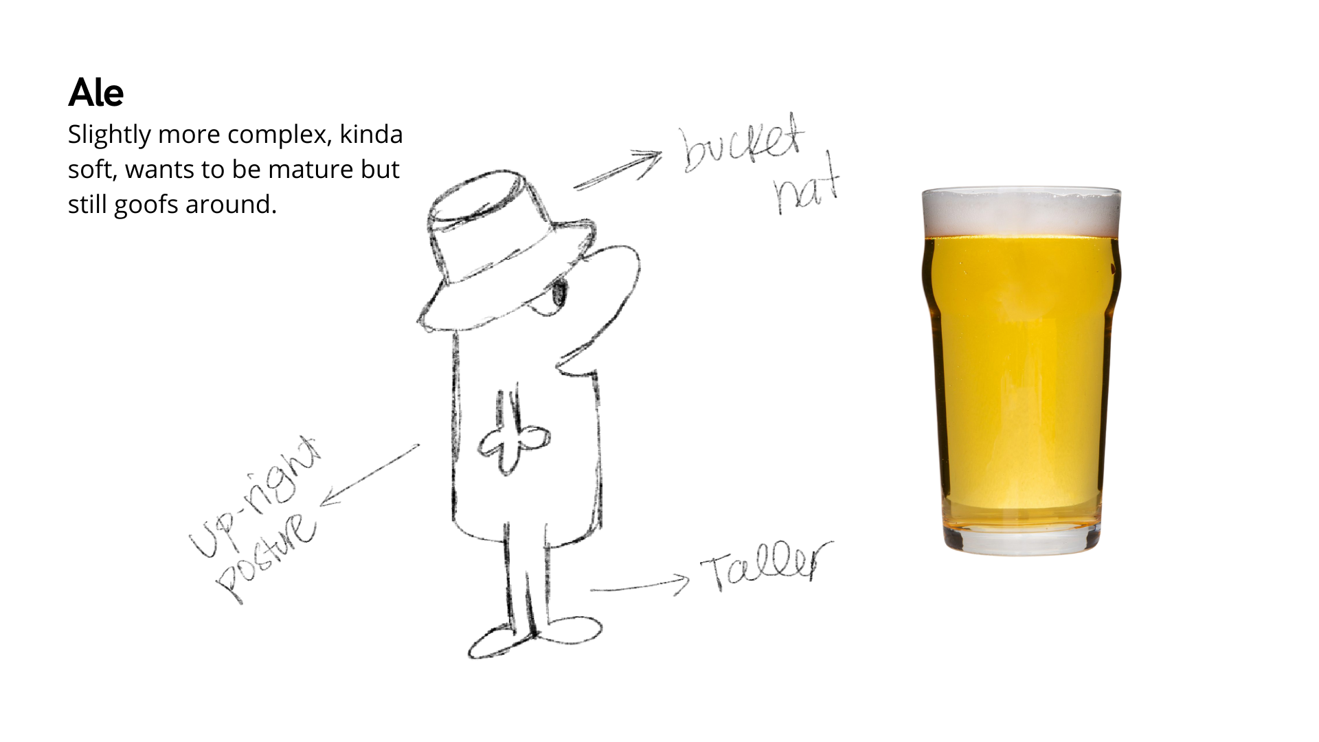
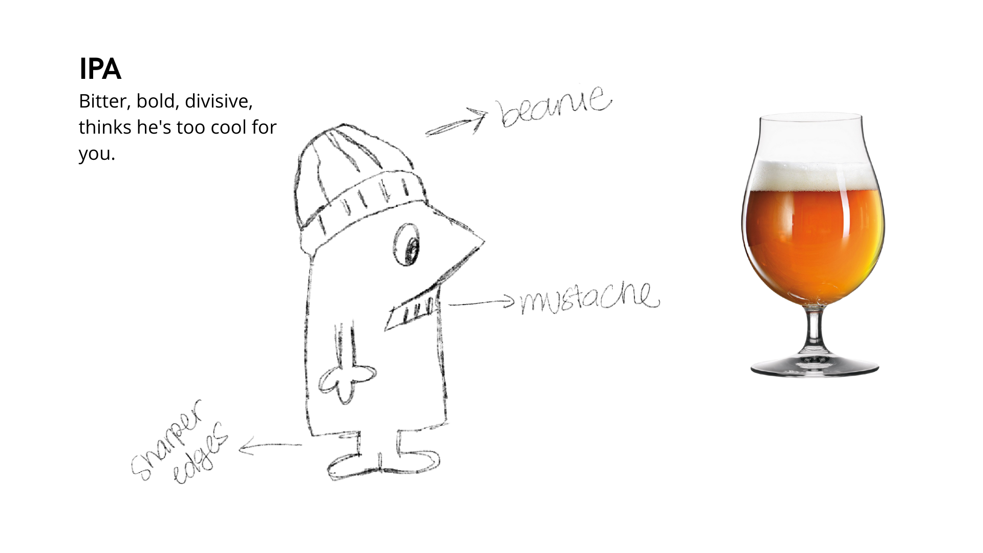
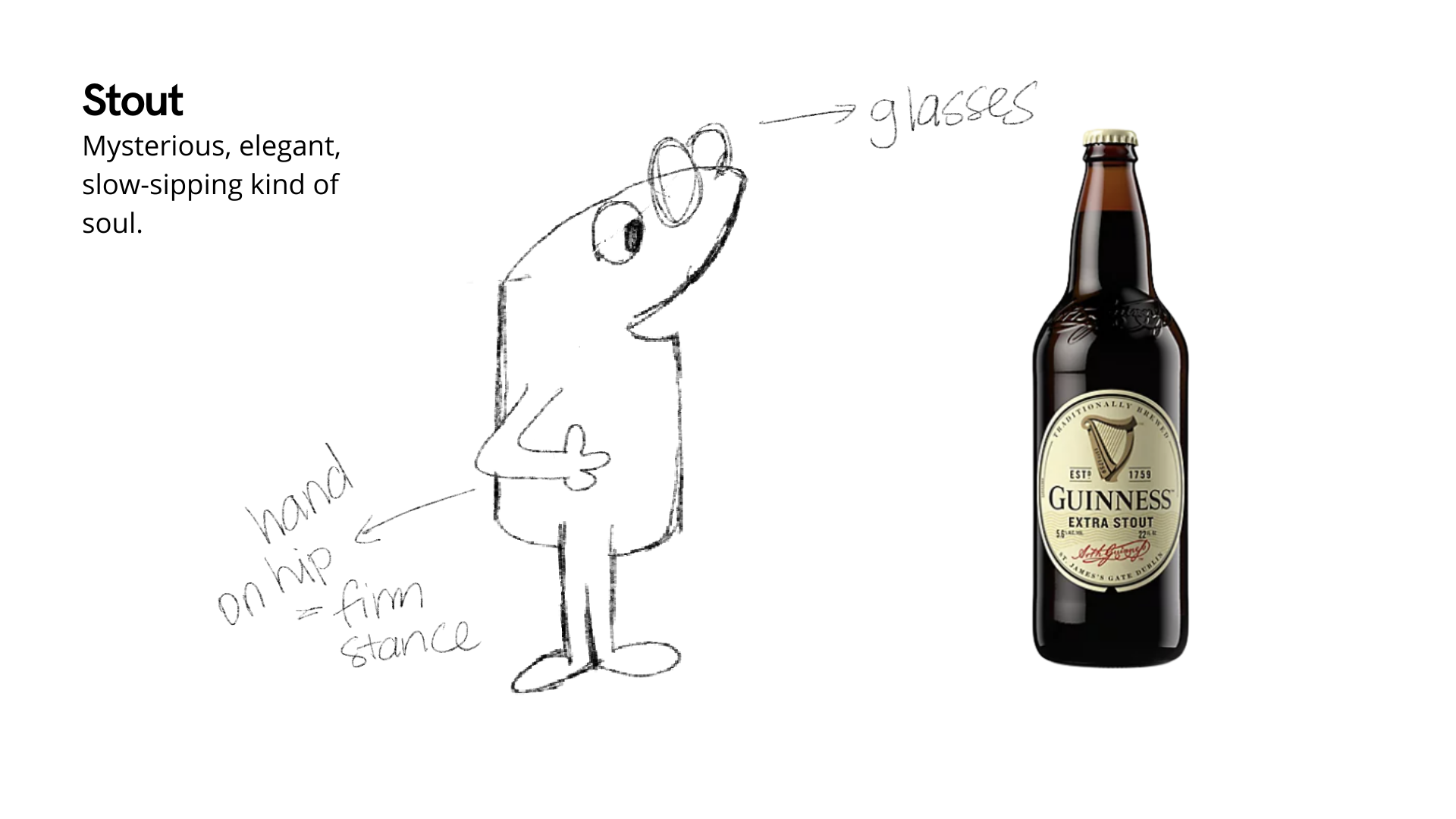
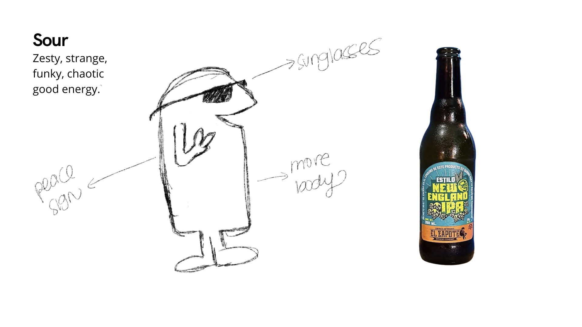
Turn five beer categories into characters, creating a playful and relatable brand system. Inviting the audience to connect, identify, and feel part of the experience.
Created a new character to represent a member who joined the group later.
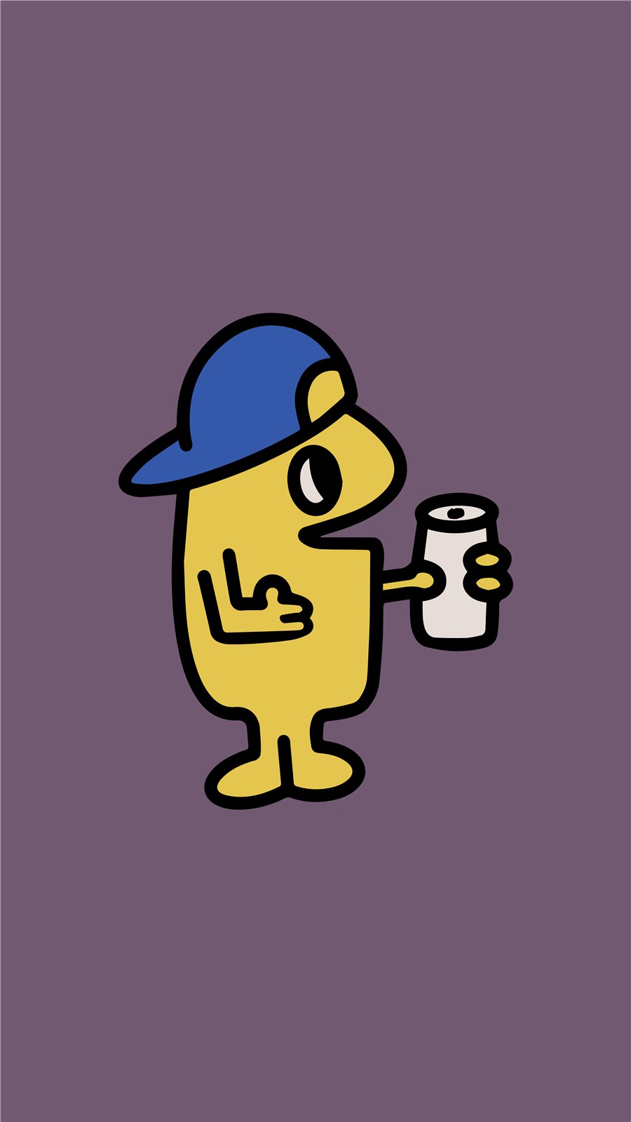
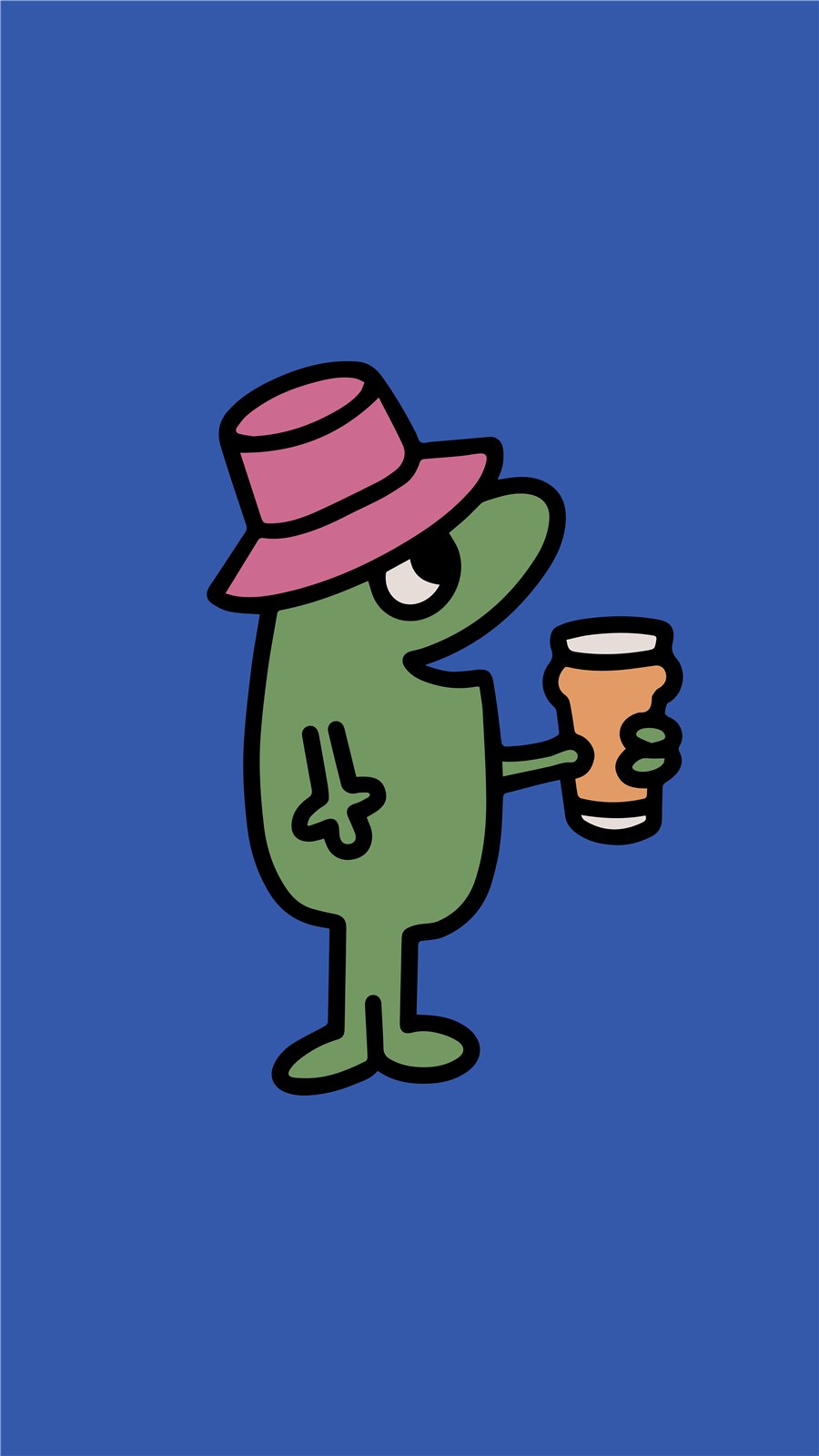
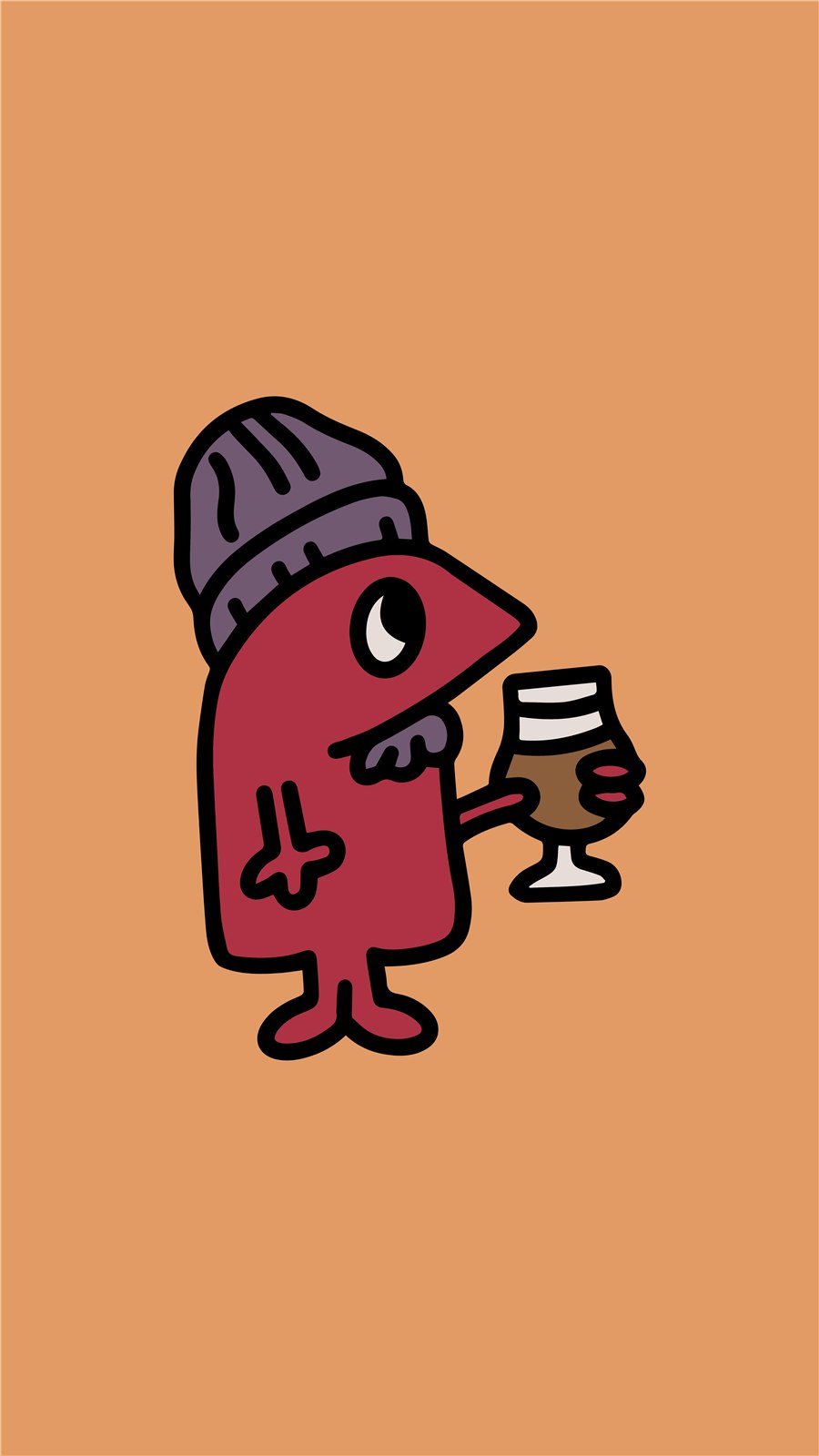
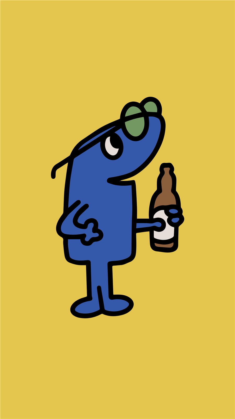
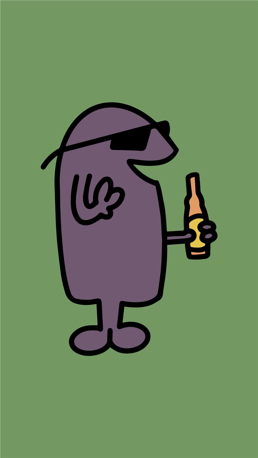
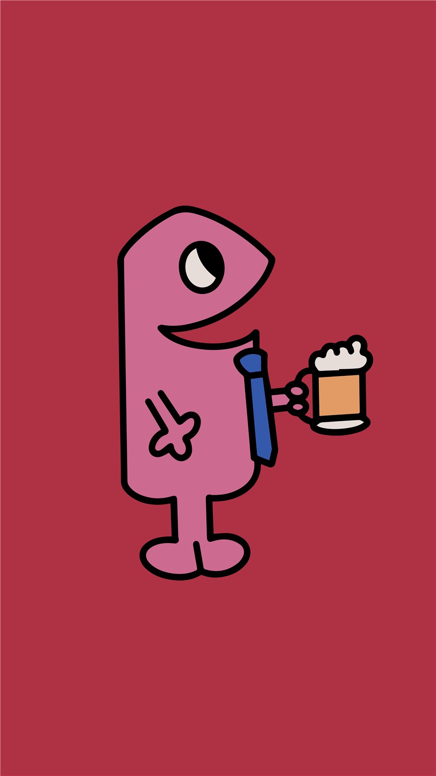
All assets were made in Adobe Illustrator.
Process
Research
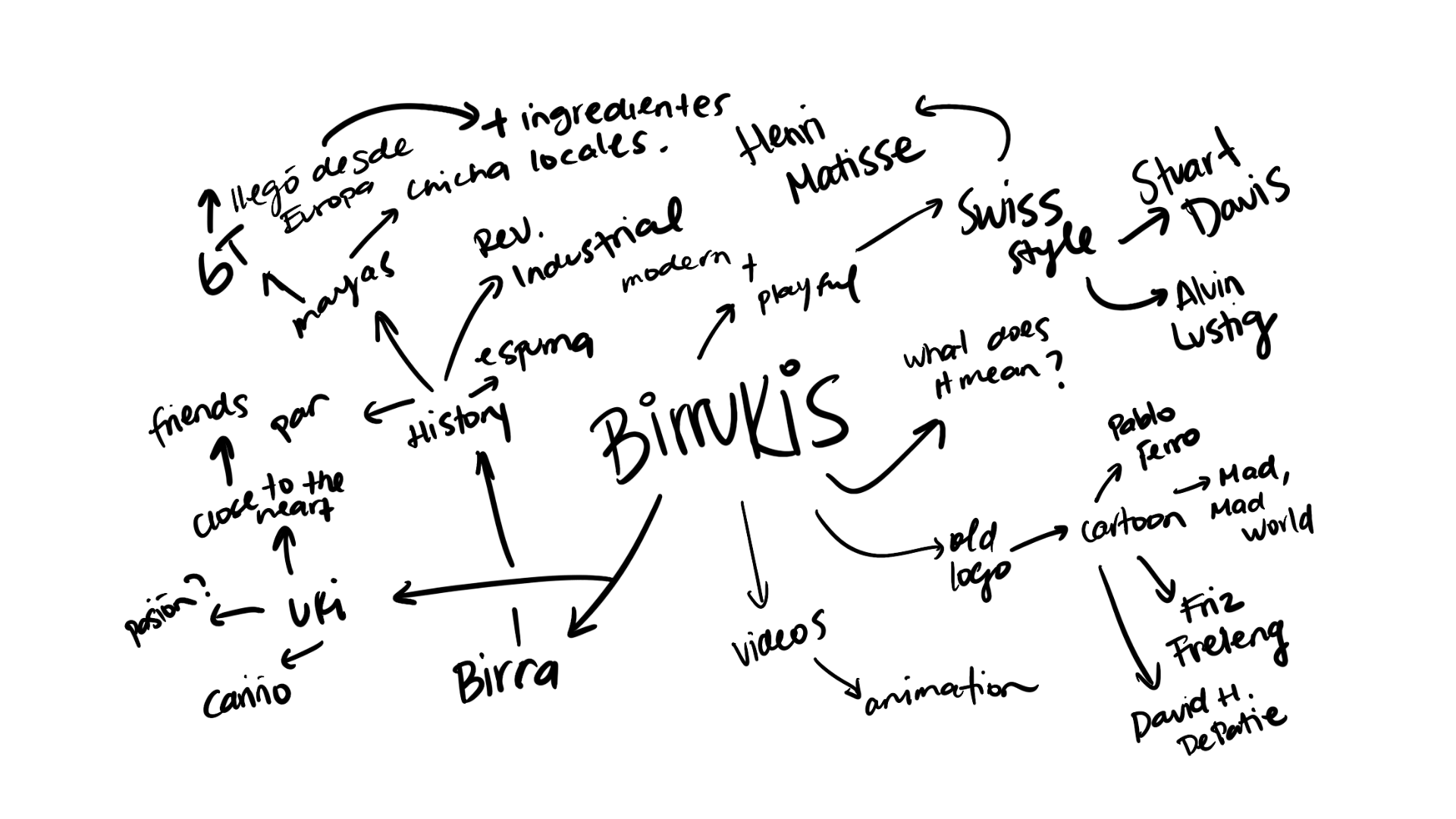
Researched beer styles, production processes, and cultural history to understand how ingredients, brewing methods, and tradition shape consumer perception.
Afterwards, I brainstormed ways to connect what the brand aims to represent with my findings.
Character sketches
Logo
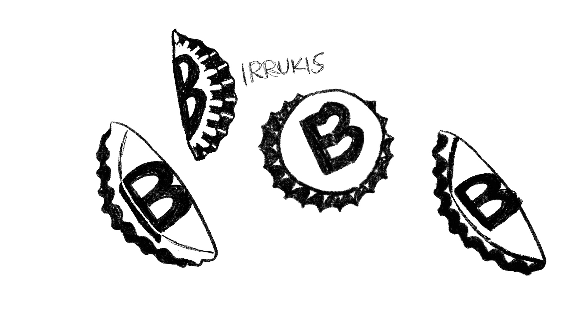
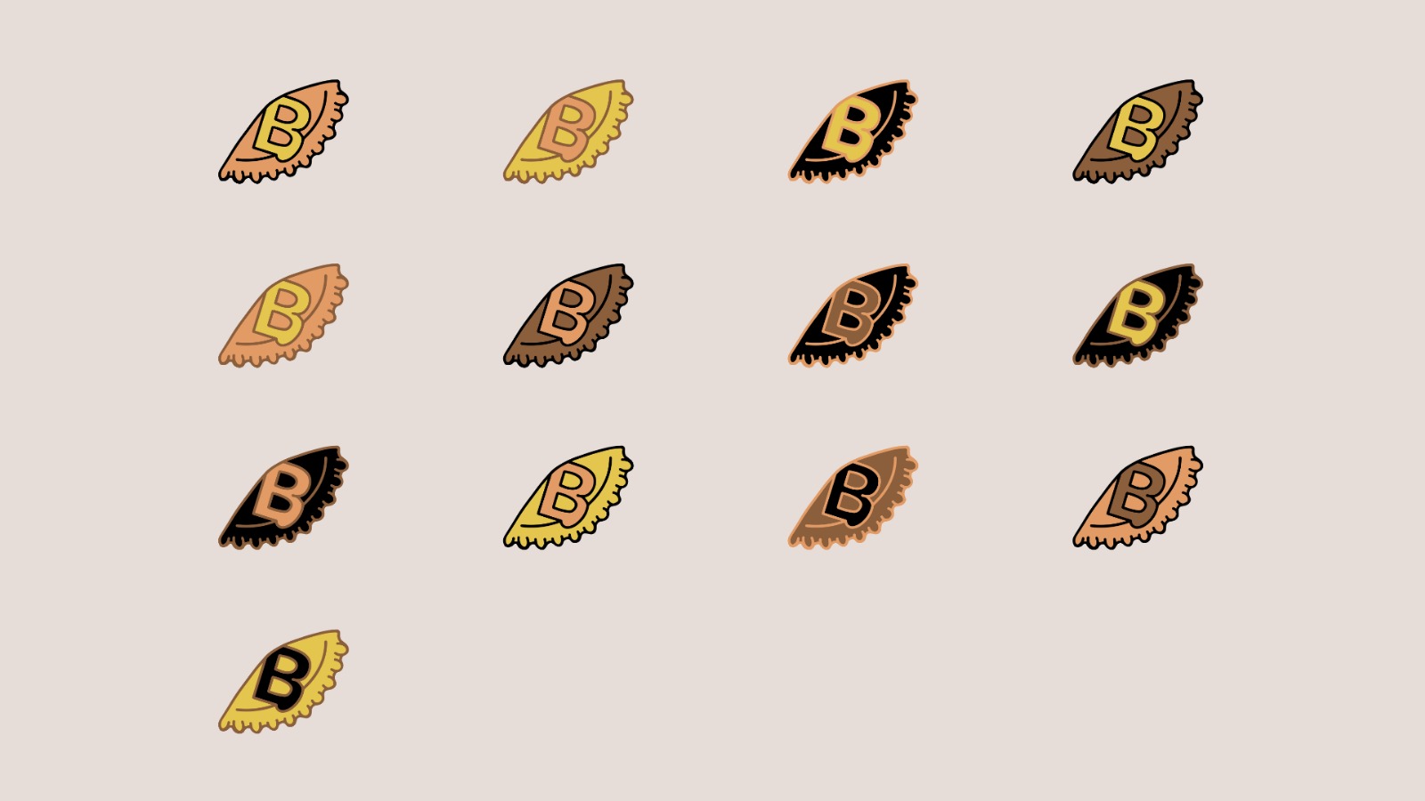
Sketched a main logo to unify the brand system, symbolizing how in Guatemala, when there are no ping pong balls to play beer pong, people fold beer bottle caps and use them instead.